Corporate Identity
IPARK Hyundai Development Company plays a core role in realizing IPARK’s mission, “Form of Better Life,” across residential and urban domains.We are creators of space who make every moment of everyday life more convenient, safer, and more sustainable.Building on premium residential design and extensive urban development expertise,we shape the future of cities where living, infrastructure, and urban environments are seamlessly connected.
We are “The Shaper of Life Futures,” realizing the future vision of cities and life.
-
CIRCULARITY
IPARK understands the relationship between cities, architecture, and people as a single, interconnected ecosystem.
We create a balance of life where technology and nature exist in harmony and form a cyclical structure. -
INSPIRING INTELLIGENCE
IPARK connects life through advanced AI-driven technologies.Our spaces awaken the senses and bring inspiration and emotional richness to everyday life.
-
LIVELY HARMONY
ATTENTIVENESSIPARK brings warmth and stability to everyday life within a structured order.
A refined balance creates an environment where comfort and vitality coexist, enriching everyday life with energy and warmth.
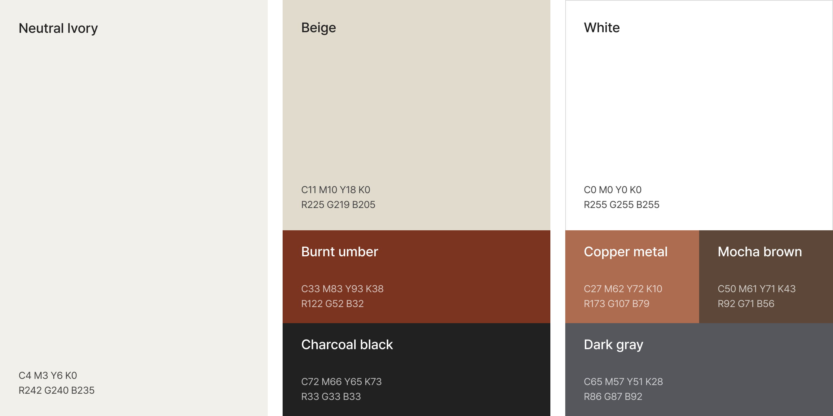
- *The logotype design, including its colors and sizes, may not be altered or reproduced partially or arbitrarily in any other forms.
- * Using the original (digital) file without any changes or modifications ensures that the identity of IPARK Hyundai Development Company is well maintained.
Brand Identity
IPARK’s design integrates AI technology with eco-friendly sensibility to spatially realize the “Form of Better Life.”
We are a partner that expands human senses and orchestrates the rhythm of the city, going beyond the act of building spaces.
Within the balance of technology and nature,
we bring warmth and vitality to both urban environments and everyday life.
SEOULONE’s design harmonizes the elegance of traditional serif with the clarity of modern sans-serif, while naturally extending the visual identity established by IPARK.
Its solid structural framework reflects the reliability of IPARK Hyundai Development Company’s architectural expertise, while the soft curves connecting the structure symbolize the organic connection between space and people.